SATO Cosmetics Logo Design
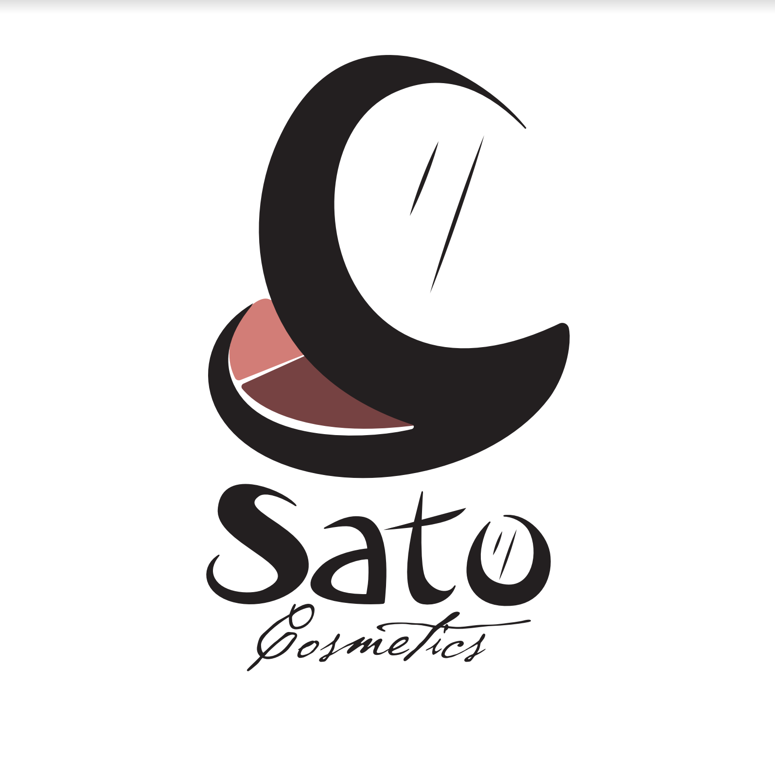
Logo Design for a cosmetic company
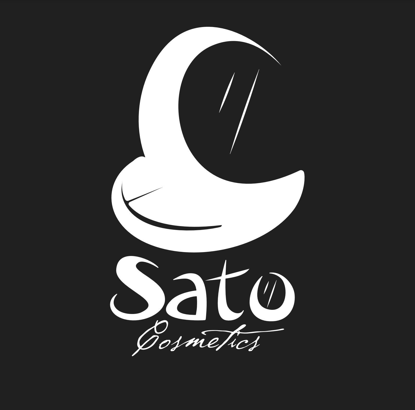
Logo Design inverted
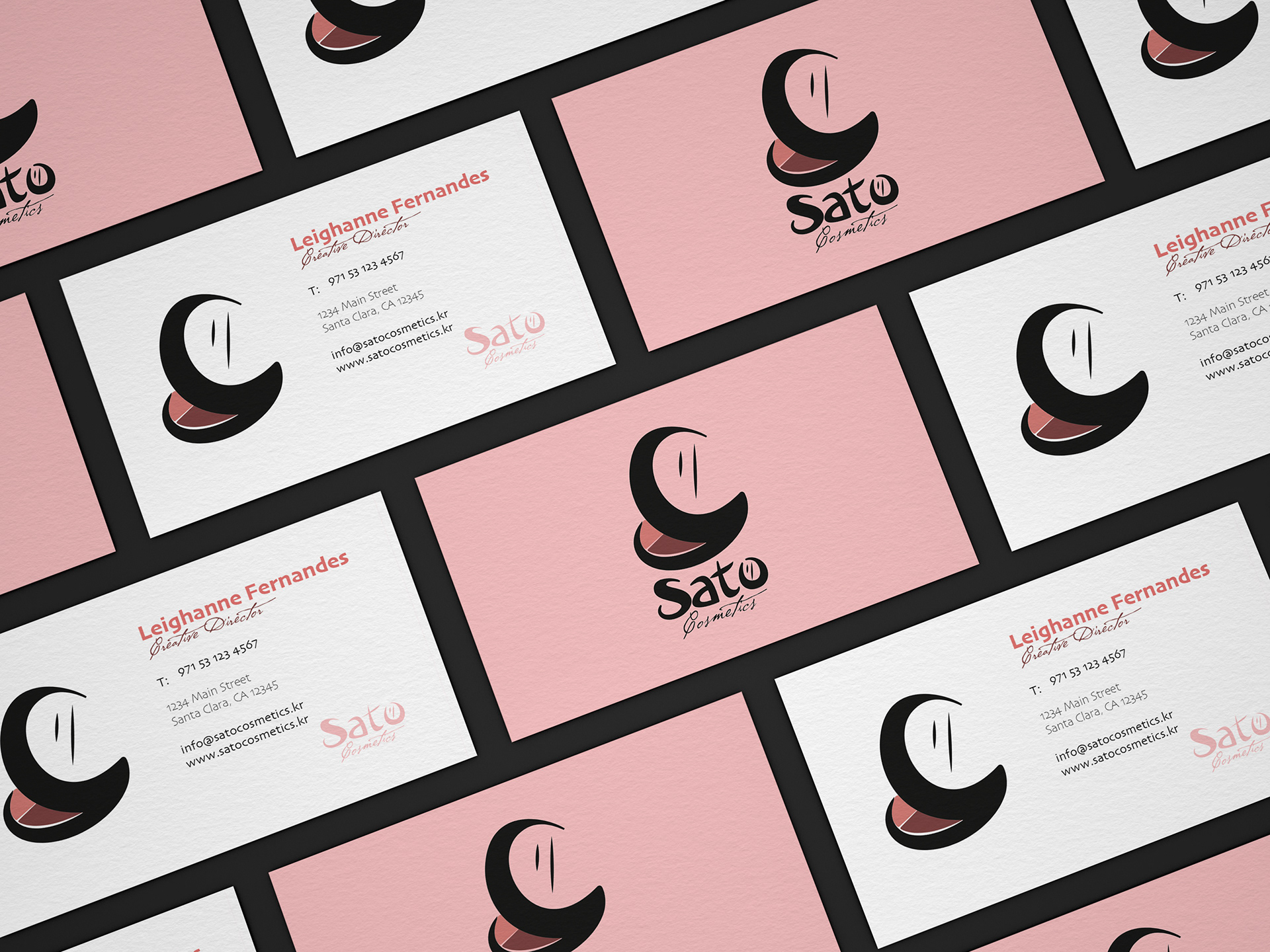
Business Card mock ups for Cosmetic Company
Here are some logo designs with business card mock ups made for a project. I used the idea of going for a combination logo where the symbol represents that of a blush palette with a mirror to reflect the ideal scope of work of the cosmetic company, while the customized font also flows in line with the style of the designed symbol logo. The font might subtly throw hint at the origin of the company being in an Asian country through its unique use of brush stroke lines that date back to the traditional era of brush calligraphy writing on scrolls.
Software used: Adobe Illustrator
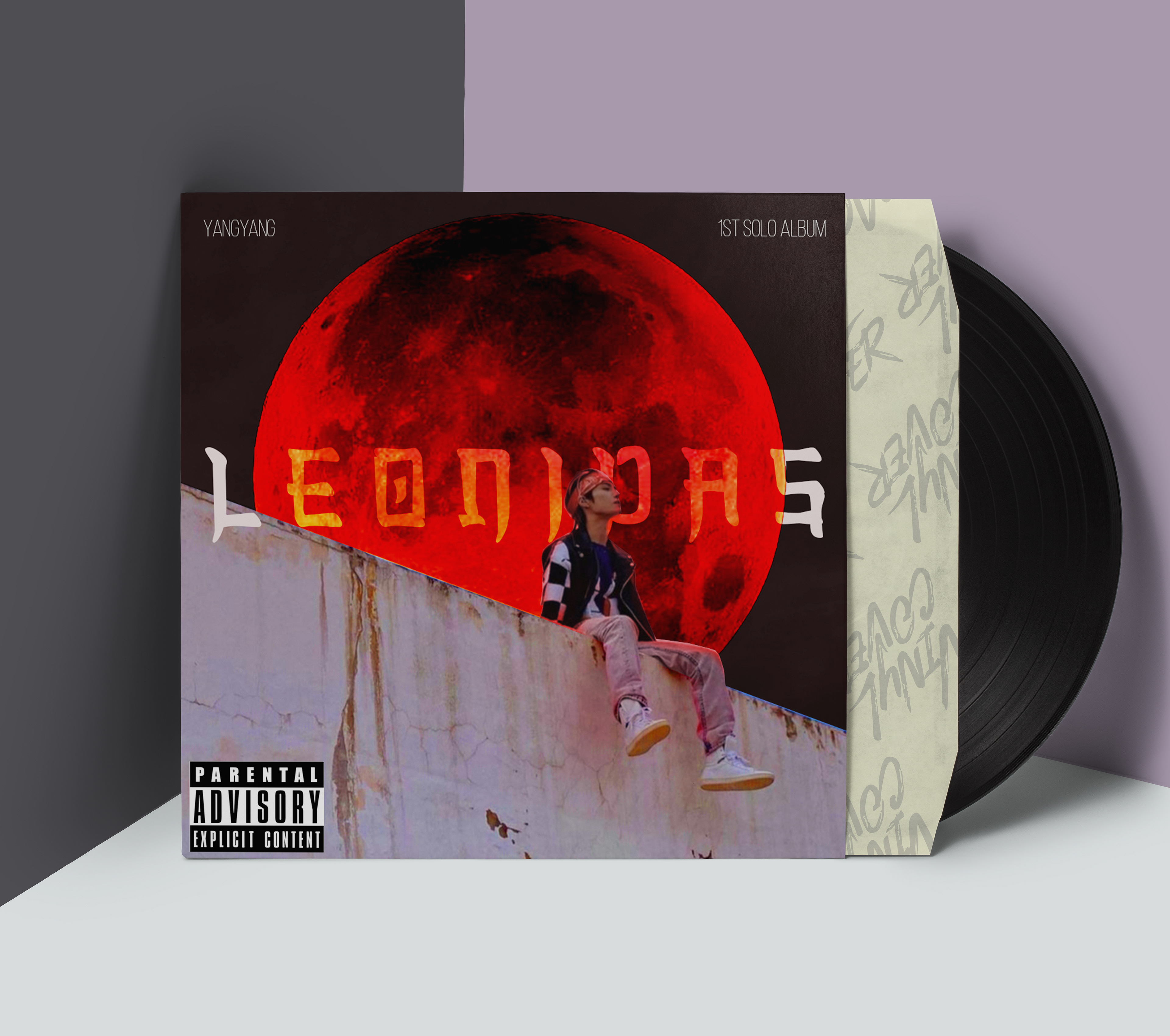
Album Cover Challenge
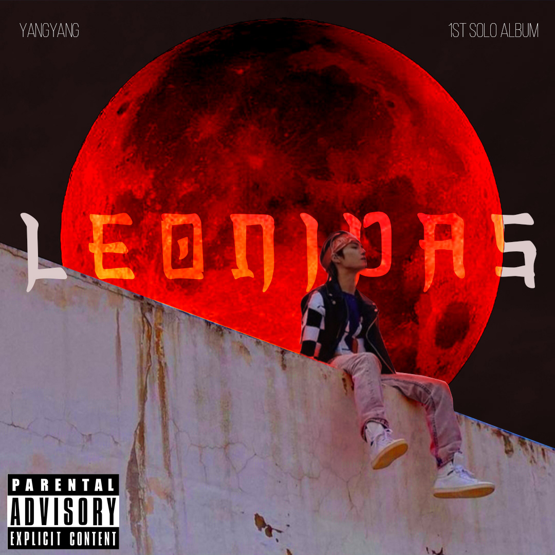
Album Cover

Tracklist
Mock-up
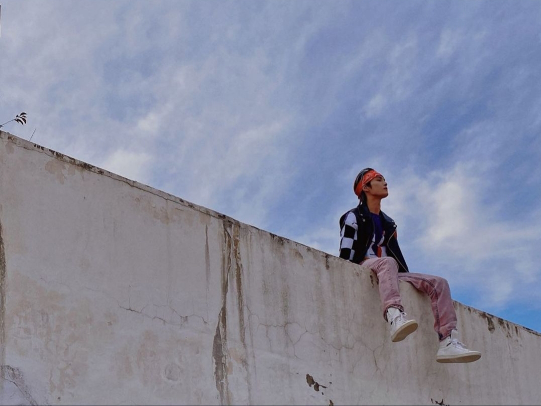
original image given for the challenge ;)
I'm not one to share personal projects that were merely done as fun challenges on here :P but I was quite pleased with how this one turned out!
The last image seen in this carousel was given to edit and design into an album cover. I took up this challenge and tried to come up with various ideas that could suit a potential vibe. I based it off of a single titled "LEONIDAS" written and rapped by the artist in this image Liu YangYang, and composed by another member KUN.
Software used: Abobe Photoshop
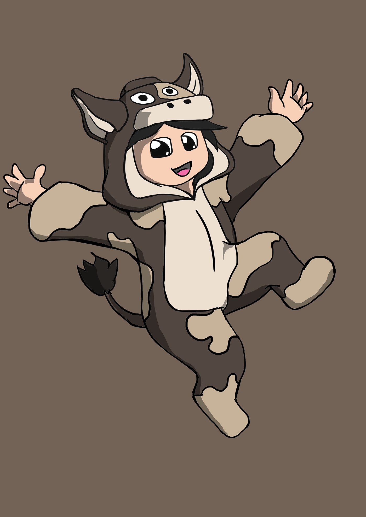
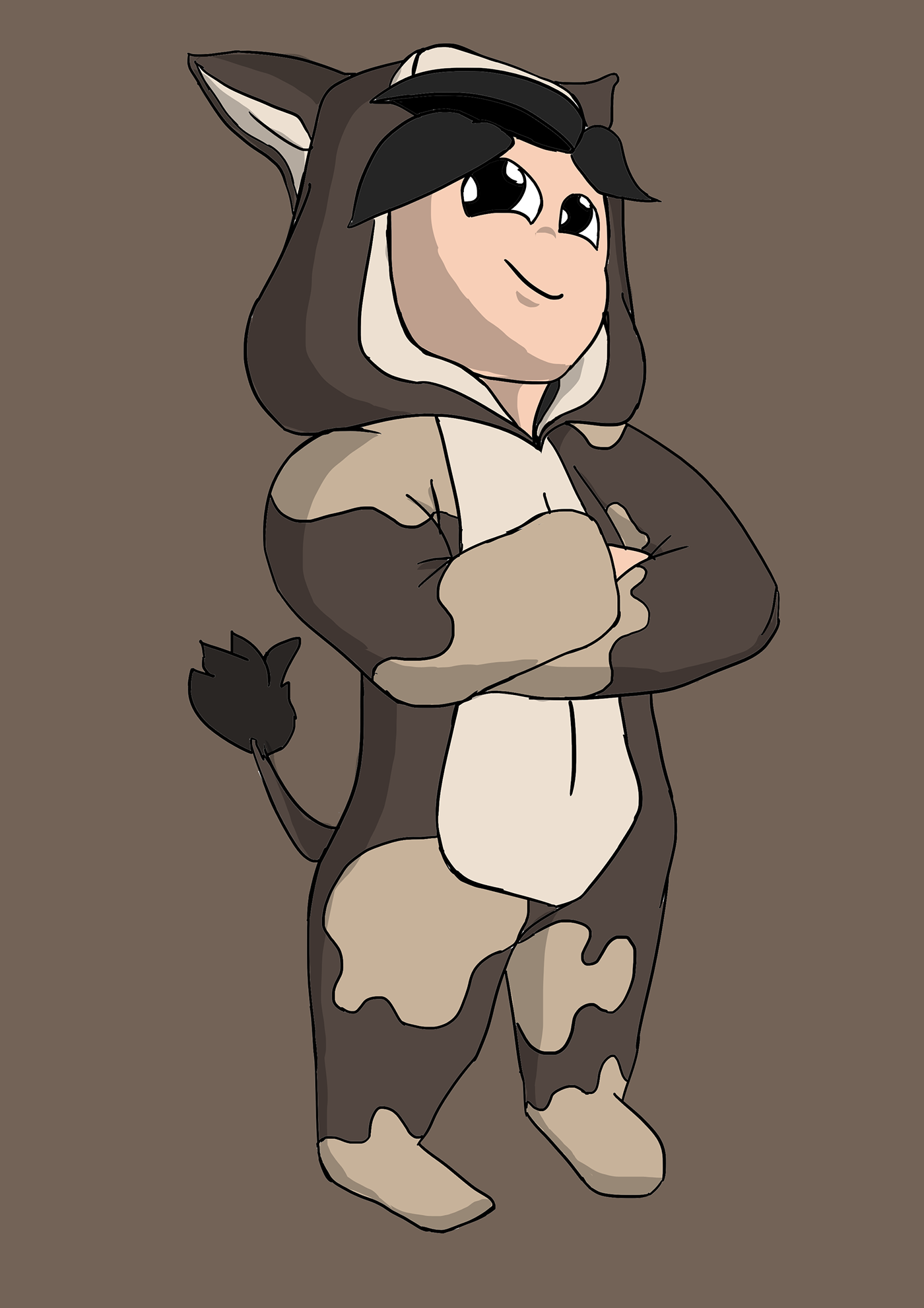
Character Design concepts for a children's milk brand YAMOO

Concept Art and instruction sheet for VR game puzzles
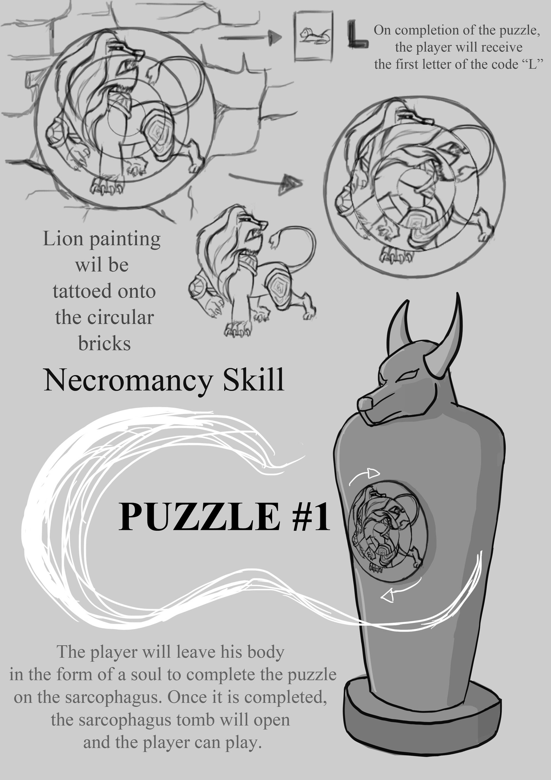
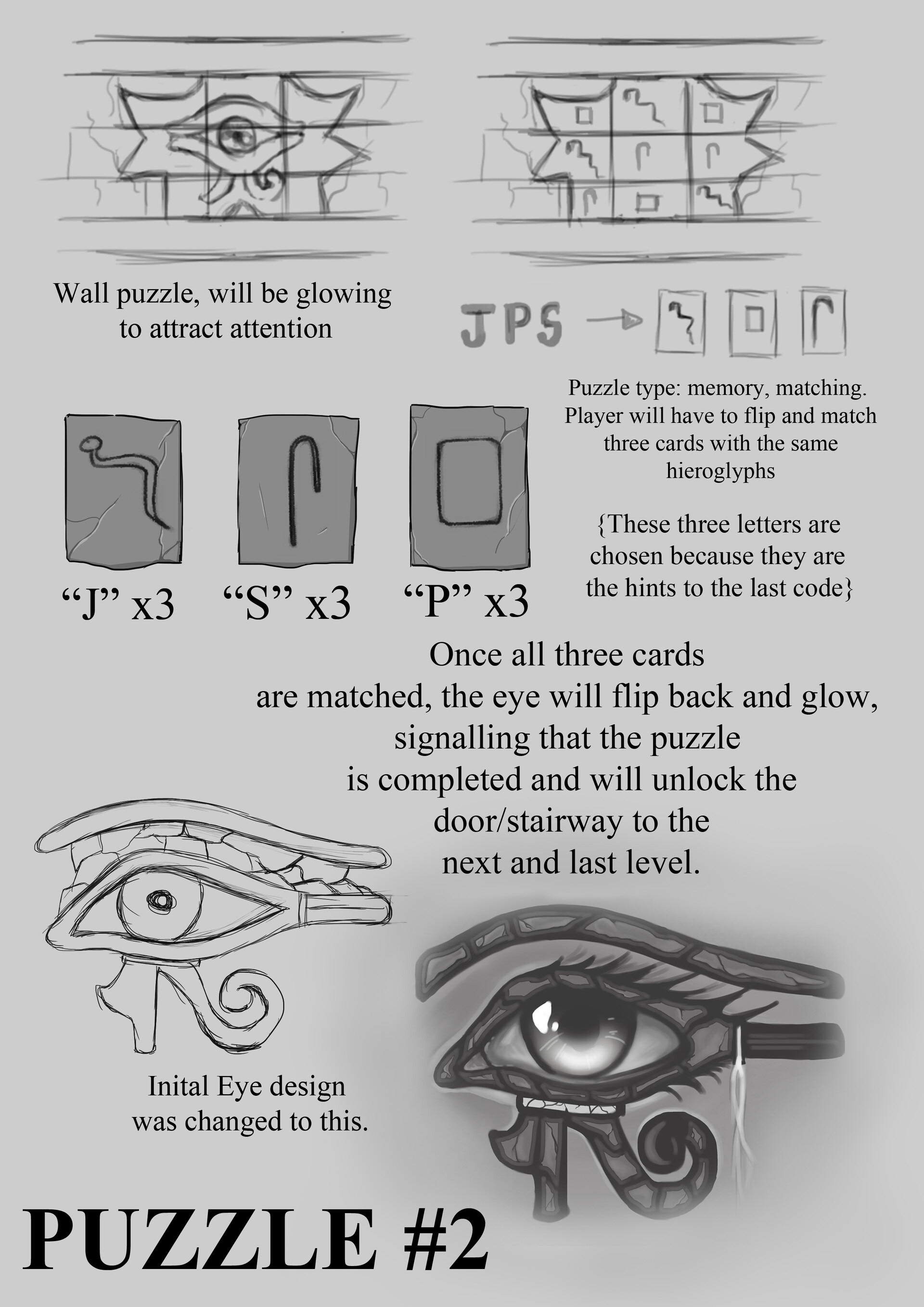
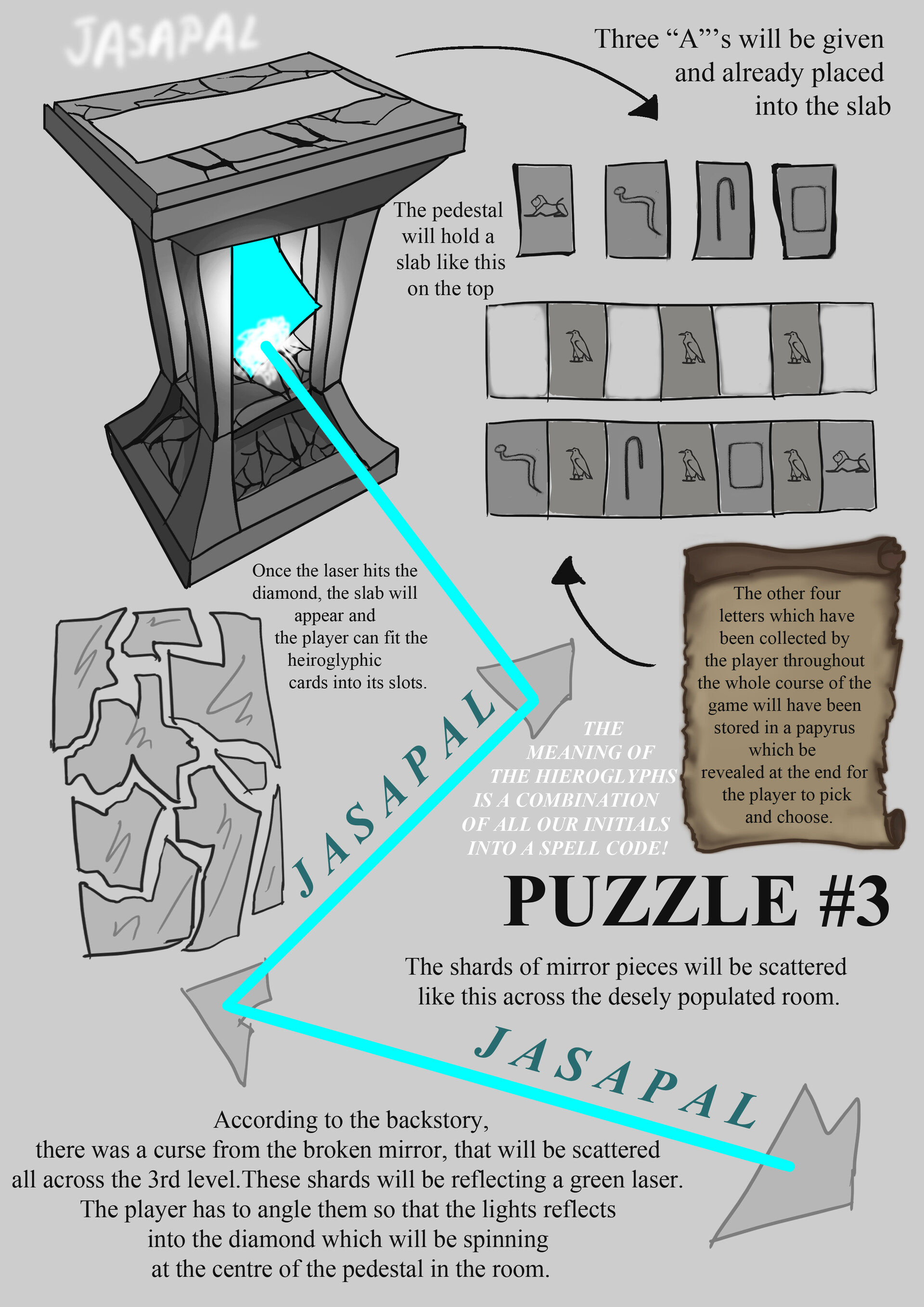
Three puzzles were concepted and designed by me for a VR game project. Each concept has been explained through illustrations and text and can be seen here in 3D.


Scroll further down below to watch the gameplay of these puzzles.
PUZZLE 1
PUZZLE 2
PUZZLE 3
Robot & Sushi Concept Illustrations
Portrait
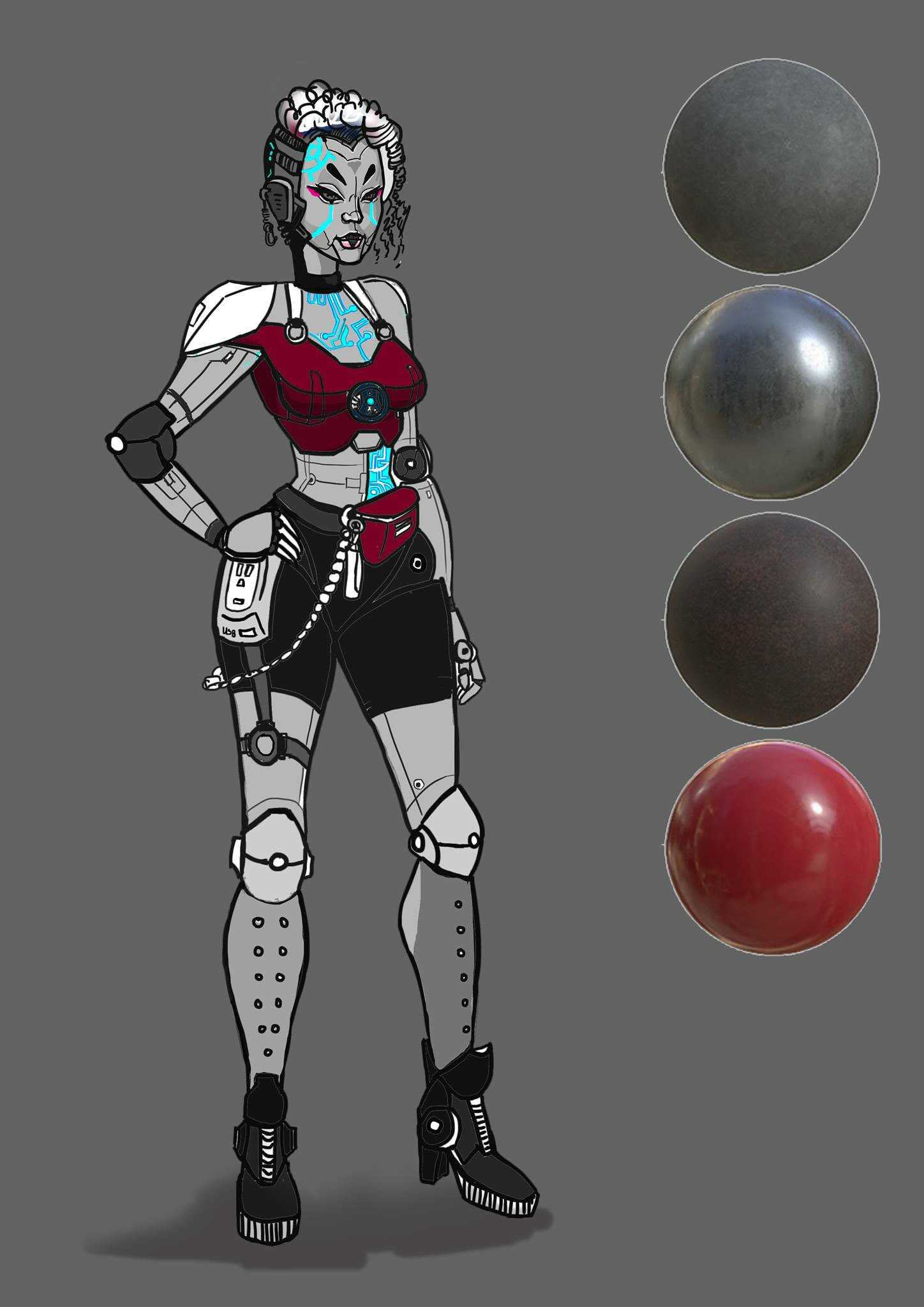
Colour and material
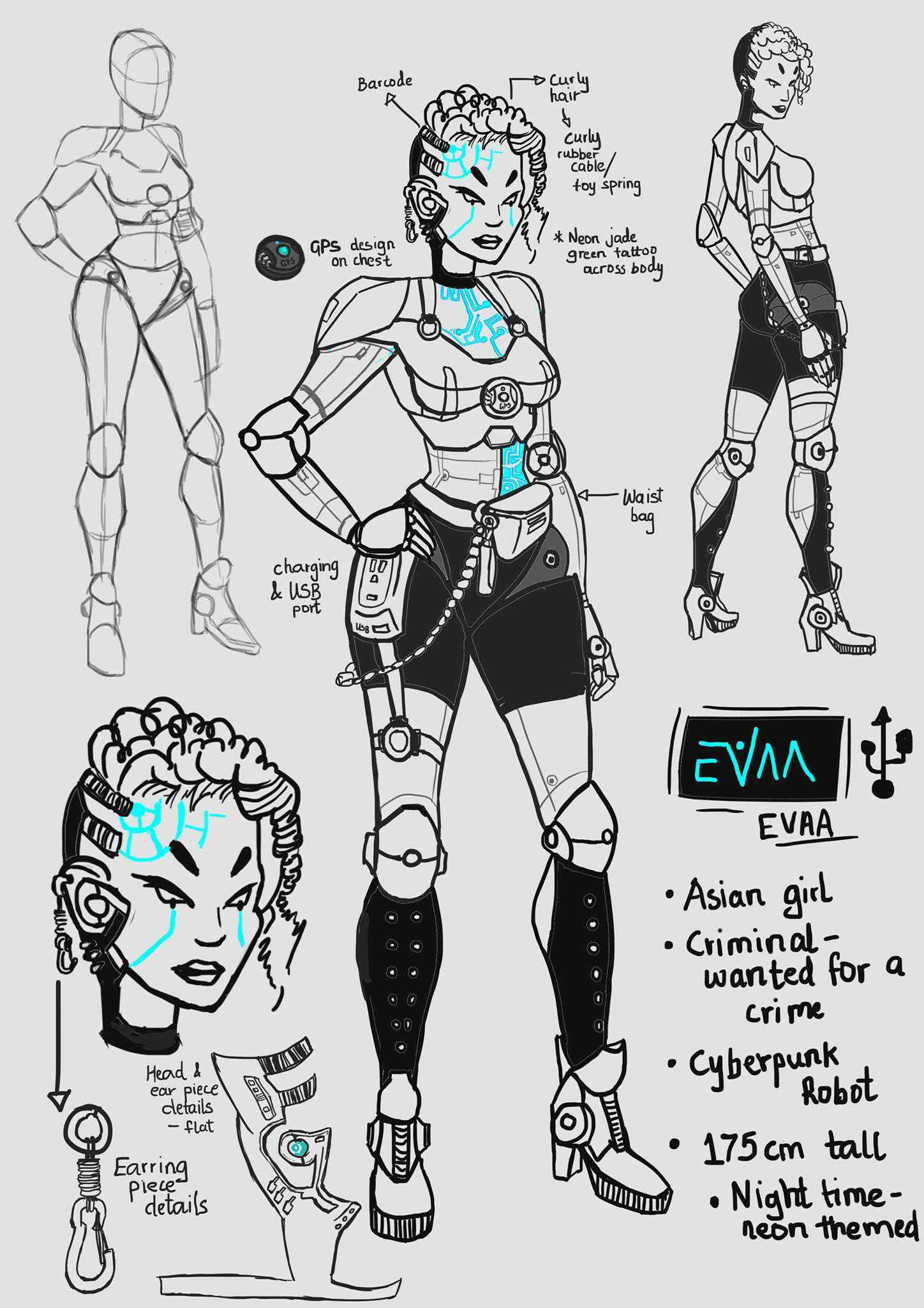
Details
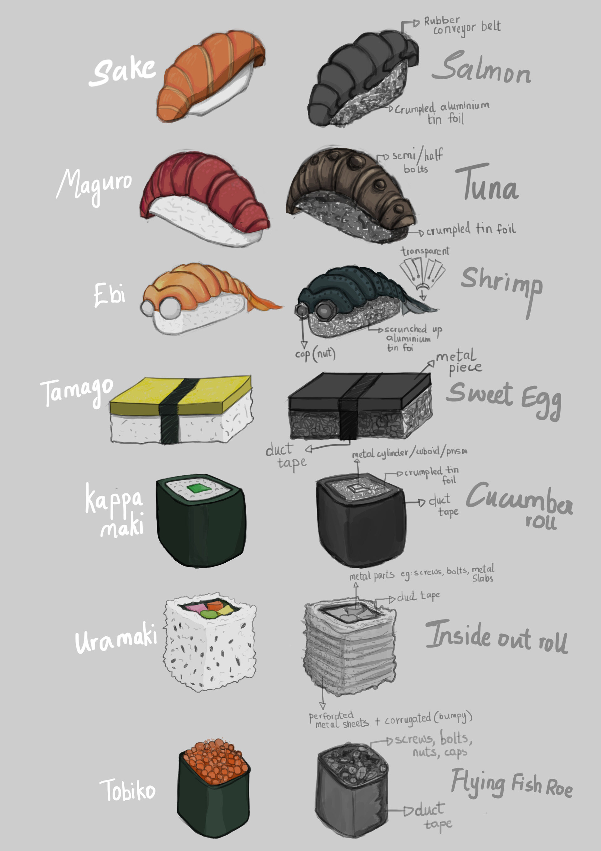
Sushi concept
These illustrations were made for a short still life film. As you can see from the sushi concept sheet, the mechanical parts were derived through implementing metal parts that could resemble the overall shape and idea of the actual sushi irl.
Intro Titles 2D Animations
Here is an intro animation I created (along with the idea for the logo itself) for a dance crew named District 9 that I am also a part of in Dubai ;) The idea was to create gemstones that connect to one another in the form of a maze. It is to represent the crew members as they try to find their space within the world of dance.
Want to see some more dance related shenanigans? Head to my dance page section


